ByteTree provides essential information for bitcoin investors. A blockchain’s value is determined not by the beauty or complexity of its code or vision, but from the network (or economy) it creates.
For example, the price of bitcoin is correlated to many things related to its network, such as Google searches, the number of wallets, or the hash rate. These things will rise with the price because they reflect traction, even if they may be at an arm’s length. On-chain metrics are the most direct and timely way to measure network activity, and the results speak for themselves.
I will show you some indicators measuring the dollar transaction value (spend), the coin transaction value (coin), and dollar network fees (fees), using different time series. I have deliberately used a range of different indicators and time frames to diversify the results.
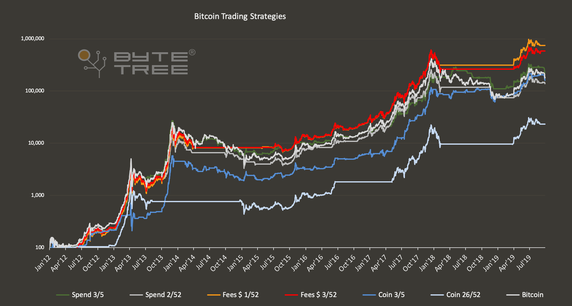
When a strategy is invested, it is exposed to bitcoin. When uninvested, it remains in cash and the “equity line” goes sideways as a result. The blue strategies measure network fees. I like fees because they have a cost, which makes it expensive for network traffic manipulators to fake them. Essentially, fees rise in bull markets and decline during bear markets, along with network usage. Fees $ 1/52 means we are using the one week fees in US dollars and the 52 weeks fees in US dollars. When one week fees are greater than 52 weeks fees, the indicator is in bull mode, and when below, in bear mode. This can be seen on the chart below.
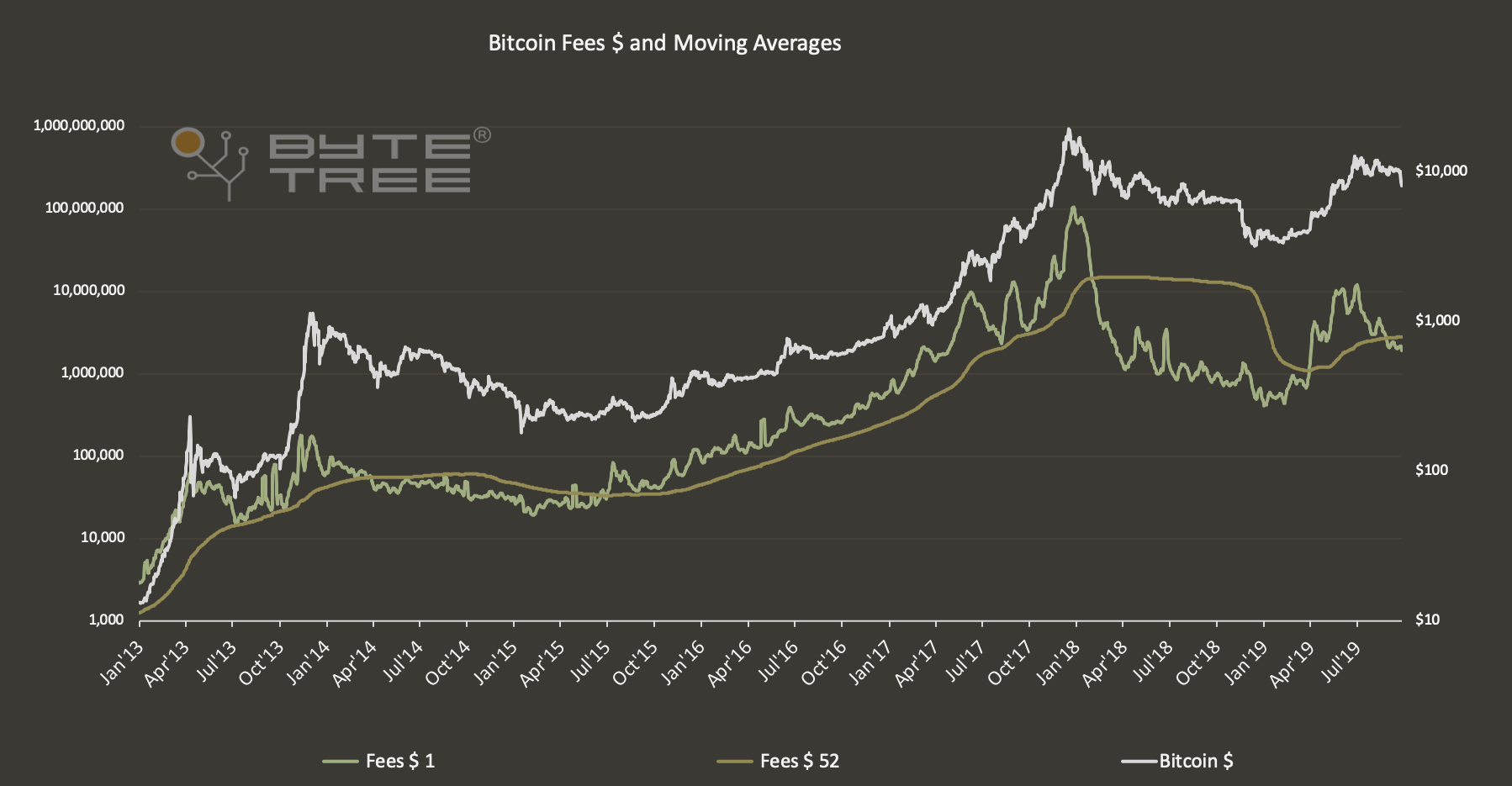
One week fees have spent most of the time above 52 week fees except during the prominent bear markets in 2014 and 2018. The indicator turned:
- bearish on 20th March 2014 at $588
- bull/bear signal in March 2015 which was soon reversed (small profit)
- bullish on 30th June 2015 at $261
- bearish on 31st January 2018 at $9,961
- bullish on 30th March 2019 at $4,077
- bearish on 28th August 2019 at $9,666
Although this simple strategy hasn’t captured the tops and bottoms perfectly, it has given bearish signals at nearly double the price of the bull signals that followed, and done so twice. It has added significant value to investor returns by avoiding much of the capital destruction from bear markets.
The indicators are calculated in the same way. The shorter time period must be higher for a bull signal and lower for a bear. Here are the other indicators in bull mode:
- Spend 3/5 transaction value $; 3 week greater than 5 week
- Spend 2/52 transaction value $; 2 week greater than 52 week
- Fees 1/52 fees $; 1 week greater than 52 week
- Fees 3/52 fees $; 3 week greater than 52 week
- Coin 3/5 transaction value in bitcoin; 3 week greater than 5 week
- Coin 26/52 transaction value in bitcoin; 26 week greater than 52 week
Testing the data
Back testing can be dangerous because best fitting the past, doesn’t necessarily predict the future. But there can be no doubt that growing network activity positively impacts the price, and this is something that is becoming more relevant as the network matures. Consider that the junior coins are driven by speculation and hype, in contrast to the more mature networks that are more heavily influenced by fundamentals. You can be sure of that because Bitcoin no longer has such large daily moves on rumours such as hacking, who is Satoshi, or regulation.
The signal and the noise
These six indicators have been combined using a points system. If all 6 strategies are in bull mode, the score is 6, and likewise 0 if they are all in bear mode.
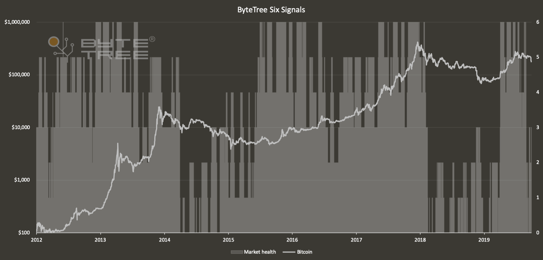
The results are somewhat noisy, but the bear markets in 2014 and 2018 are clearly visible. To tidy it up and smooth the data, the next chart shows you what happens when you use the signals by voting. A score of 4 or more means bull and a 2 or less means bear. To eliminate the impact from 3s, you wait for a reversal. That is; once a bull signal given (4 or more), it must drop to 2 or less to see a bear. To move back into bull, it must signal a 4 or more once again. There are now two states, bull or bear, which give an indication of market health.
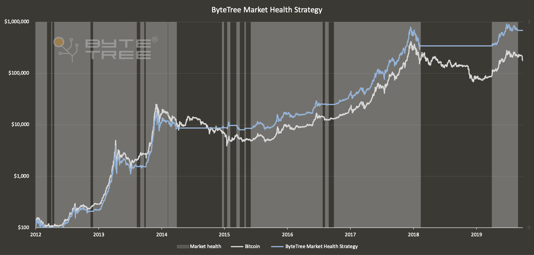
The shaded areas are bullish, when the market is in good health, and the blank areas are bearish, when the market is in poor health. It is noticeable how fewer signals are given as the network has evolved. Early 2015 was a confusing period while many wondered if bitcoin would ever recover. It did and an entry price of $261 is a respectable outcome.
This can be illustrated in the final chart where the ByteTree Market Health Strategy is shown relative to bitcoin. There is some volatility, because the strategy uses the next day’s price to give reasonable time to trade. When the line is rising, the strategy is preserving capital when the bitcoin price is falling. When the blue line falls, that means the bitcoin price is rising when the strategy is uninvested.
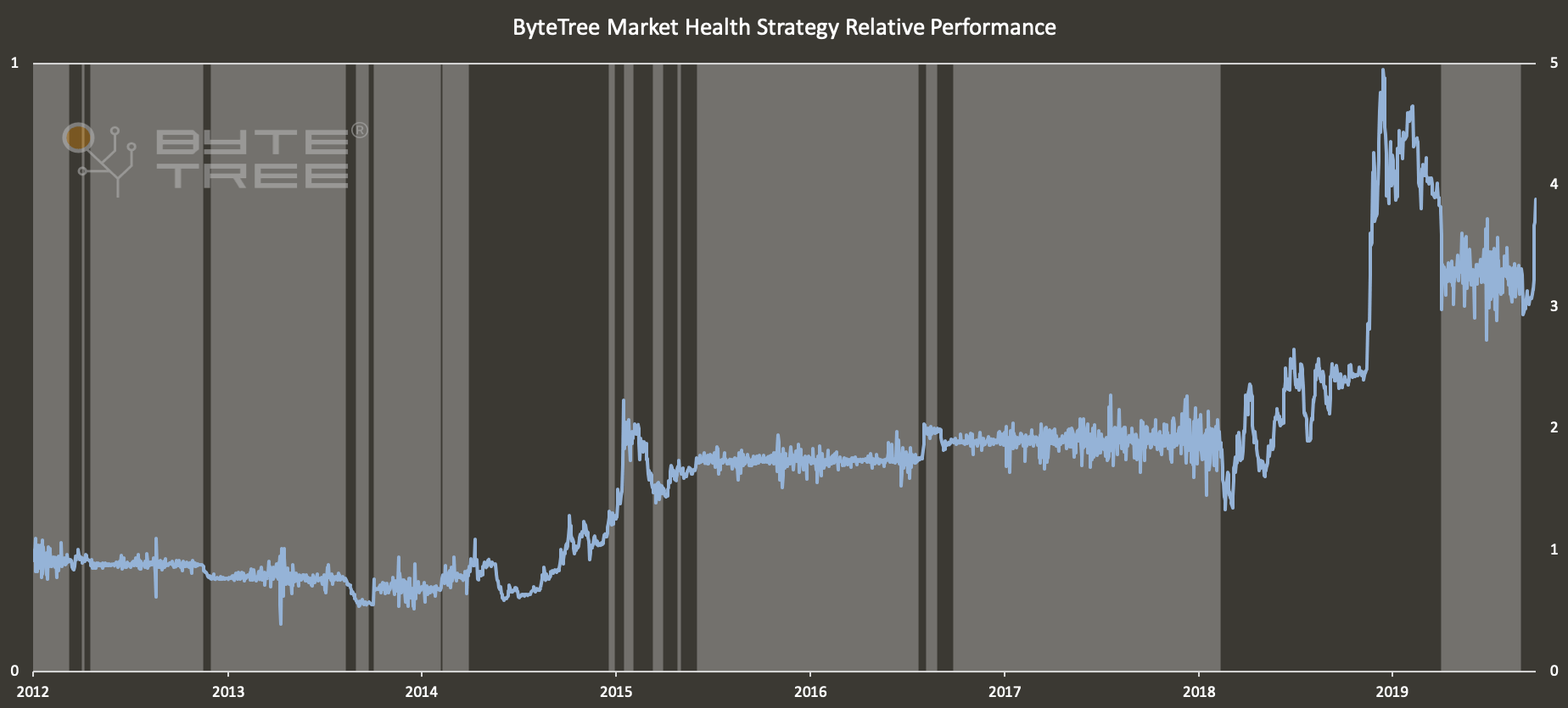
Since 2012, this strategy has been invested 62% of the time. It so happens that 38% of the time that it wasn’t invested saw some of the worst capital destruction in bitcoin’s history. To invest in a market that is healthy and avoid one that isn’t is a sensible approach.
The market turned bearish on 28th August at $9,666. You could be unimpressed by this signal for being slow as the market briefly exceeded $12,500 in June. But consider that this recent cycle has seen just 24 days above $11,000 and 5 days above $12,000. Bitcoin investors shouldn’t be worried about the what if scenarios. The most important thing is to know when it is safe to be invested and when it isn’t.
The good news is that you can construct indicators like these using ByteTree data, which will soon be available. You could add velocity, % fees, miner’s inventory, and much more. We are also analysing spend in much more detail; all to improve the signal from the noise. But if you just want to know when bitcoin will return to good health, please sign-up to our mailing list, and you’ll be the first to know.


