Challenging the Stock to Flow Model Created by Plan ₿

Disclaimer: Your capital is at risk. This is not investment advice.
Plan ₿ wrote an enjoyable paper that linked the falling supply growth of bitcoin (BTC) to an increase in price using the stock to flow model (SF).
“Stock” is the current number of BTC in existence, whereas “flow” is the number of new coins mined over the past year. With stock rising slowly, and flow falling quickly in the years ahead, SF will rise, and this is thought to drive the BTC price ever higher. This model can be applied to precious metals as well.
I like this idea and the way the argument has been presented, but I disagree with the paper’s findings. Creating value is difficult and should not be taken for granted. For the BTC network to be worth a trillion dollars or more requires many things to happen, not least, mass adoption. I will show why SF will not lead to value creation by covering demand, flow and active stock.
The timing is topical because BTC miners currently sell 13,000 BTC each week and collect $100 million for their efforts. In May 2020, post halving, those miners will only have 6,500 BTC to sell. If the $100 million of investor demand is stable, then you might conclude that the BTC price will double. Unfortunately, free markets don’t work like that as it isn’t just flow that can be sold. Stock can also be sold to the outside world. That $100 million is not exclusively earmarked for the miners.
The SF model is a nice and simple idea, but I believe that it cuts corners on both the supply and demand side of the equation. I hope that BTC will thrive in the future, but for that to happen, the BTC economy needs to grow. It’s hopeful to assume that value creation is in the bag courtesy of a rising SF. The link between a rising SF and a rising price is untrue, not only for BTC, but also for gold.
Demand
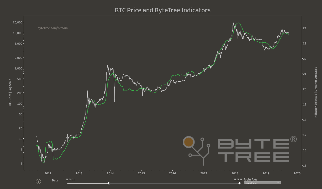
A crypto network is valuable if it is busy, and worthless if it isn’t. That is, crypto value is linked directly to the level of network activity. We know that because the network value (mkt cap) has a close relationship with the level of dollar transaction value (TV$) as shown in the chart.

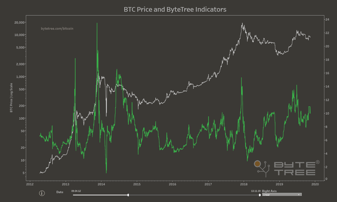
ByteTree publishes BTC’s TV$ in real time – it can be seen in the “Network” section on the site. The current reading for TV$ is $14 billion per week (average over the past 12 weeks), and is currently falling.
The link between the network value (or market cap) and the TV$ is shown by the NVT. It is a simple measure of valuation, that expresses the number of weeks’ TV$ relative to the network value. The current reading is 9 weeks, hence $14 bn/wk * 9 weeks = $126 bn, which is the bitcoin network value (the ByteTree adjusted version removes unspent coins). The historic average for bitcoin’s NVT is approximately 7 weeks.

An NVT of 12 weeks or higher should be deemed to be a high valuation which suggests the market is overheated. High valuations do not tend to last for long, and since 2012, BTC has spent only 7% of the time with an NVT above 12.
If the next halving doubles the price of BTC from $7,500 to $15,000, then the NVT will rise from 9 wks to 18 wks. Since 2012, BTC has spent just 16 days, or 0.5% of the time, with an NVT at 18 or above. It is hopeful to think that something that has rarely happened in the past will become the new normal. The price can’t double, on a sustained basis, without seeing an explosion of network activity.
I’m not saying BTC won’t go to $15,000. Indeed, I hope it will, but it won’t come courtesy of halving. It will come because the TV$ doubles from $14 bn/wk to $28 bn/wk (or preferably higher). After all, BTC has already enjoyed 76 days with a TV$ above $28 bn/wk, in early 2018. BTC needs growth. Falling flow does not create value.
Next, we’ll look at flow.
Flow
The SF calculation takes the number of BTC in existence, stock of around 18,050,000, and divides it by the number of new coins, flow, which was 670,000 over the past year. The answer is around 27 years. That is similar to taking the rate of coin inflation (ByteTree 3.85% unadjusted) and inverting it. The answer comes to 1 / 3.85% = 26 years. The paper makes the comparison with gold, which has an SF of 63 years. But in gold’s case, supply varies, just as it does in all commodity markets. Commodity markets balance supply against demand, greased by liquidly from speculators. The price can be highly sensitive to these changes, especially in markets with low stock (or inventory) such as natural gas, where an average of only 40 days’ demand is in storage. The SF is a mere 0.1 years, and the result is that the natural gas price is volatile.
In gold, stock is around 190,000 tonnes according to the World Gold Council. That is all that has even been mined, and that number is an estimate. Annual production is around 3,000 tonnes, or 63 years’ supply. The high SF means the gold price has low volatility, as there is a plentiful supply if required, albeit at a high price. It does not follow that a fall in production will cause the gold price to rocket as there is 63 years’ stock to bid for; not just this year’s flow. If the price was high enough, people would sell their wedding rings.
There are many factors that impact gold, not least my own methodology that you can read here. The long-term driver is the ever-present devaluation of fiat money (inflation), with real interest rates and speculation being shorter term factors.
Proponents of SF in gold point to gold mine supply being counter cyclical to the gold price. The price rises when supply falls and vice versa, but this is cause and effect. A rising gold price will attract production whereas a falling price will lead to mine closure. Gold miners don’t anticipate bull markets, they react to them. The capital markets will only fund mining projects at high gold prices and vice versa. Macro economics sets the gold price, and the mining cycle is a slave to that, with a lag of several years. That there’s too much gold production at the top of the cycle, and not enough at the bottom isn’t the driver of the cycle. It’s the other way around.
The same is true for BTC. The miners are motivated by high prices and mining difficulty rises as they compete for the prized flow. Miners have been so fierce in the arms race, that they have brought forward the mining of the 620,000th block by around 232 days. The current block height is 33,000 blocks higher that it would be if the average block time was 10 minutes, as originally intended. This is another way of expressing difficulty.
BTC miners are worried, because although $100 million sounds like lots of money, their high-powered computer hardware is expensive, as is the electricity they consume. Although hard to quantify, many miners would struggle with half the current block reward. To set up a BTC mining operation today, you would need to be confident the BTC price would consistently trade well above $10,000 from May onwards. If it doesn’t, expect to see difficulty fall. Just like the gold market, difficulty (production for gold) follows price, not the other way around. In 2014, BTC difficulty saw its growth rate fall, and in 2018, it declined. Difficulty has risen the fastest during bull markets, as there were higher cash rewards.
Furthermore, BTC buyers don’t have to buy from miners as as any BTC holder is free to sell. The SF supply thesis, by implication, treats the network as a closed circuit, as if the only coins available come from the miners. That is untrue. If BTC owners lose confidence, they will sell and compete with the miners for whatever external demand there is.
The final point I’d like to make is on active stock. There is a difference between coins that are alive and dead.
Active stock
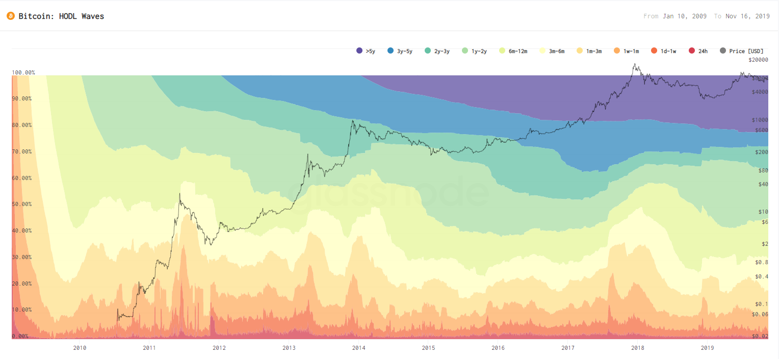
BTC total stock is known, because it is hard wired into the code. What is unknown is which coins will have a useful and productive life, and which will become couch potatoes. The SF model looks at the stock against the flow. I suggest that active stock would be a more useful comparison than stock. To bring this to life, I’ll show you a chart from our friends in Berlin who have created HODL Waves. Hat tip to Glassnode.

The hotter colours (red, yellow etc.) show you the percentage of BTC that are on the move, whereas the colder colours (purple, blue etc.) show the coins that have stood still. The number of HODL, sleeping, lost or dead coins seems to be growing slowly over time. You can see that as the chart slowly becomes darker as you shift from left to right. It is striking that only 40% of bitcoins have moved over the past year, which means 60% of all BTC are couch potatoes.
The chart also shows price. It is quite clear that bull markets are associated with hot summers, whereas bear markets are cold winters. For example, in late 2018, 80% of BTC hadn’t moved in over six months. Little wonder the price collapsed to $3,000, as value creation demands a vibrant network. Couch potatoes do not add value.
SF should take this into consideration. If only 40% of the 18.05 million BTC are currently active, then this should be reflected in the SF model. There are now 7.2 million active BTC and so the SF needs to fall from 27 to 11. That decline in network activity is also being reflected on the demand side. TV$ would undoubtedly be higher if more BTC got off the couch and went to the gym. To take this line of thinking to an extreme, if all the coins were inactive, there would be no transactions, there would be no network, and bitcoin would be worthless.
A failed altcoin might have the same SF as BTC, but it should really have an SF close to zero because the active stock is zero, regardless of continued mining operations. Many altcoins are worthless because they have negligible active supply and extremely low TV$. Regardless of how high the SF becomes; they aren’t going to the moon.
Litecoin (LTC) and Bitcoin Cash (BCH) are not dead altcoins as their networks are vibrant. They both have approximately the same SF as BTC, with both having inflation close to 4%. Yet their network values are just 3% of BTC’s. It would be interesting to see the active supply for BCH and LTC. Presumably it is low, or else their prices would be higher. Also consider that halving did little for LTC this year and will probably do little for BCH in April 2020.
Summary
The SF model doesn’t show the demand side of BTC, and assumptions on the supply side are incomplete. It would be unprecedented for the BTC price to double without TV$ leading the way and BTC is incapable of trading at an NVT of 18 for more than a few weeks.
SF is a supply side model. Stock doesn’t take into account network activity, and flow assumes that the network lives in a closed circuit where only the miners do the selling. Both of these are incorrect. The tightness of new BTC flow has created confidence, just as it has for gold. We know that because if BTC or gold had higher inflation (falling SF), they would have lower value. But that doesn’t make lower inflation (higher SF) value accretive; it merely builds confidence and price stability.
Fiat currencies with an inflation problem lose their value quickly (Turkey, Venezuela), but it doesn’t follow that deflationary currencies (Switzerland, Japan) are good investments. They only rise against currencies that are worse than theirs. No investor holds fiat as a long-term investment, they buy assets. Which is why BTC is great. It’s an asset rather than a currency. If it were a currency, it wouldn’t be very interesting. High SF leads to lower price volatility, not to higher prices. Gold has is less volatile than natural gas and the Swissie and the Yen are less volatile than the Lira and the Bolivar.
I hope 2020 sees the BTC network move forward, and if halving gets people interested, then that’s great. Future supply is known, whereas demand is unknown. Wealth creation doesn’t come easily or quickly. If you want BTC to rise, then get those couch potatoes moving. Making the BTC network ever more vibrant will see the price go to the moon. I don’t suppose many black and white TVs are made these days, but if SF were true, it would make me want to buy one.

Comments ()