Glitter or GLTER

Glitter or GLTER

Disclaimer: Your capital is at risk. This is not investment advice.

Atlas Pulse Gold Report Issue 98;

The World Gold Council (WGC) has tackled gold’s long-term “expected return” (GLTER), a forecasting method for the returns of an asset class. Traditional financial assets have widely accepted expected return frameworks, and until now, gold has been the exception.

Highlights


Expected Returns Glitter or GLTER
Technicals Boom
Flows Gold and Silver Tight, Platinum Soft
Palladium Short Squeeze
BOLD ETF +61% Past Year with 14% Volatility

Glitter or GLTER

Pension funds use expected returns to better understand their long-term assets and liabilities. That makes this work important because an asset with an accepted expected return framework is more likely to be recommended by the investment consultants than one that isn’t. In other words, a well-laid-out investment framework could lead to new demand for gold from institutional investors.

Global equities are generally thought to have long-term expected returns of 5% real, which means 5% plus inflation. For bonds, it’s 1.8%; for cash, it’s 0.8% (source: Robeco). Many, including myself, have suggested gold’s expected return is between 0% and 1%, which means it tracks inflation over the long term.

This idea originated from Roy Jastram’s book, The Golden Constant, published in 1977. The thesis was that the gold price kept up with the price of goods and services in the long run, leading to humorous measures such as Julian Baring’s price of lunch at the Savoy Grill priced in gold ounces or Incrementum’s price of a pint of Guinness in gold. Having a framework where gold’s expected return is above inflation means the cost of living is always falling when measured in gold.

The post-pandemic world has forced gold observers to adapt or die. My old valuation model was based on the idea that gold acted as a perpetual inflation-linked bond issued by god, which worked perfectly until the pandemic. In recent years, my views have changed, and I now sit in the money supply camp, which is also inflation plus.

The money supply looks at the amount of money in the financial system, whereas inflation reflects the cost of living. If the global economy and population are growing, it stands to reason that the gold price should participate in the general expansion of the system. 

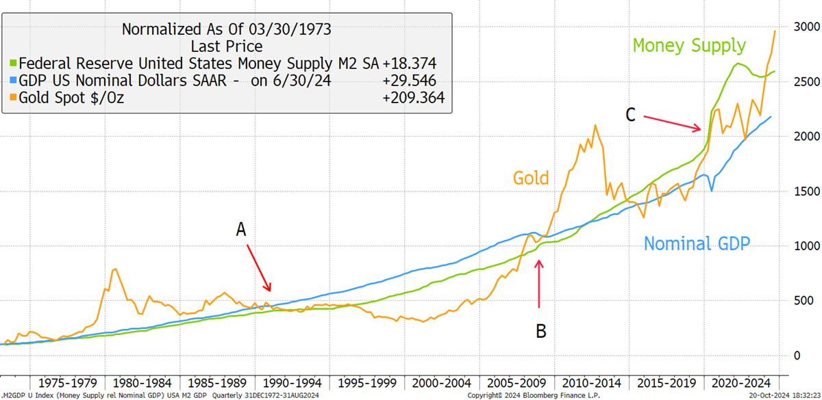
GLTER has landed in the nominal GDP camp. Nominal GDP is real GDP, which politicians talk about, plus inflation. It is a monetary measure of the size of the economy, which has grown at a trend rate of 7.1% p.a. since 1960.

Source: Bloomberg

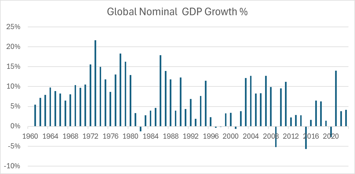
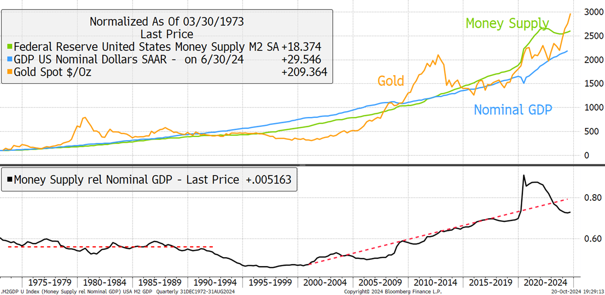
Other than the 14% growth reported in 2021, nominal GDP growth has been slowing since the 1970s. I would observe the past two years have been higher than many would think, but mostly due to inflation. Using US data, I show the nominal GDP and the money supply since 1960 alongside gold. The lower section shows the money supply against nominal GDP to highlight their differences.

Money Supply vs GDP

Source: Bloomberg

The esteemed economist Peter Warburton told me:

Barring significant geopolitical events, there is a long-run relationship between broad money supply and nominal GDP. The velocity of money is GDP divided by money supply, so institutional changes in the use of money are picked up in the trend velocity.”

He reminds us about the velocity of money, something not much discussed these days. Given gold’s strength in the 21st century, this makes sense. Between 1960 and 1990, the money supply and GDP followed one another (black in the above chart) and was around 60% of GDP. Then, it fell in the early 1990s before surging ever since. Many put this down to “the Greenspan Put”, the idea that every financial crisis since the Asian Crisis in 1998 has been laid to rest by increasing the money supply. There were further boosts in 2001 for the 9/11 attack, 2009 for the financial crisis, 2011/12 for the Eurozone crisis, and the biggest of all in the recent pandemic.

The point here is that the money supply and GDP follow one another, and so both are credible. But I think the money supply has the edge over GDP because gold is resilient during times of economic stress when GDP goes down. Looking at the gold price against GDP and money, I highlight periods A, B and C.

Gold, Money Supply, and GDP

Source: Bloomberg

Period A had strong nominal GDP growth and weak money supply, which coincided with gold weakness. Period B had negative GDP growth in the credit crisis, but the increased money supply saw gold rally. Finally, in period C, GDP collapsed during the pandemic, while gold sided with the surging money supply. I would argue that some of gold’s recent strength could be attributed to anticipation of a higher money supply.

Yet GLTER chose GDP, and I can understand why. Choosing the money supply, which didn’t get a single mention in the note, is to side with the Austrian School of Economics; the economic liberals. To many institutional investors, that would put them off. If, on the other hand, you select nominal GDP, which over the long term is more or less the same thing as the money supply, you start dreaming about things like Davos, the World Bank, and the IMF. The investment consultants are now nodding their heads vigorously and will willingly add gold to their portfolios. Gold has now become a growth asset. Bravo WGC.

In the chart below, we have global nominal GDP data (blue) since 1960. GLTER insists we don’t start the clock until 1971, when the gold standard came to an end. The gold price and GDP have been mean-reverting (black), which is encouraging. I have calibrated the average post-1971 to 100, and on this basis, we are 28% ahead of the average. But it’s late October, and you can deduct 4% or 5% for 2024’s GDP, which will turn up when the OECD next updates the data. According to GLTER, the gold price is ahead of itself, but not massively so.

Gold and Global Nominal GDP

Source: Bloomberg

GLTER is a  thought-provoking note, and I like the way it begins with a clear mission,

“While gold’s contribution to managing portfolio risk is well established, its contribution to portfolio return is not.”

While I still choose the money supply over nominal GDP, I readily admit that over the long term, it makes little difference. Both capture the expansion of the population and the economy while fully accounting for inflation. Having an expected return framework is a step forward for gold.

Technicals – Boom

Gold powered to another all-time high, closing the week at $2,721.46, and the investment industry remains heavily underweight. That means there is no overhead resistance, and investors are struggling to keep up. More to the point, they are competing with the central banks who remain keen buyers.

Silver had a 6.4% move on Friday and closed at $33.72. That broke the level last seen in January 2013, just before the great crash. Silver will likely face resistance at $35. Hopefully, it will prove to be short-lived, and then the target is a nice round $50, last tested in April 2011, and before that, January 1980. The 44-year wait has been exhausting.

Gold and Silver Power Ahead

Source: Bloomberg

Silver remains cheap gold with a “beta” of around 1.5x. That means a typical move in gold will see silver do 50% more – in both directions. Another way to put it is that gold’s long-term volatility is around 15%, whereas silver’s is roughly twice that. An ounce of silver is worth 0.012 ounces of gold (or a gold-to-silver ratio of 80). The 30-year average has been 0.015, implying a 24% upside just to get back to average. But silver doesn’t do averages; it shoots past them, and 0.02 is a realistic target, which would see 60% outperformance over gold.

Silver-to-Gold Ratio

Source: Bloomberg

I am an unashamed gold and silver bull, and while I am rooting for silver, I take great comfort in the fact that silver is lagging because, above all, this is the king of sentiment indicators. The gold bull market should not be deemed red hot until silver shines. Cheap silver is a highly agreeable situation because it means this bull market has legs.

Flows - Gold and Silver Tight, Platinum Soft

We should also take comfort in the fact that while investors have been driving ETF assets to $14 trillion, gold has been left behind. The gold ETF, born in 2003, was an early adopter in an era where I could recite the tickers. Now, there are over 10,000 ETFs, so it’s harder these days. That explains why gold once made up 17.6% of total ETF assets in late 2011, at the last peak.

Since the post-2013 gold crash, which saw the price touch $1,051, the gold ETFs have, on average, been around 3.7% of all equity ETFs using ICI equity data. Today that is 3%, and most of the recent increase has been due to the price rather than flows. Once again, this is another useful sentiment indicator. We should not fear this gold bull market because investors are underweight. In 2020, just four years ago, this touched 6.1%. It happened then, and it can happen again. There is plenty of gold waiting to be bought by global investors.

Gold’s Share of Equity ETFs

Source: Bloomberg

Gold ETFs collectively hold $228 bn of gold, an all-time high. But as you can see, the vaults held 111 million ounces (moz) in 2020 (green), and today, 83.8 moz. That is an outflow of 27.5 moz, and you can bet your bottom dollar that those investors are coming back.

Gold Investor Positioning

Source: Bloomberg

The long futures (blue) are high at 40.7 moz because the trend is strong, and that suggests the CTAs (a type of hedge fund) are long. The shorts (red) are light, so the fast money is enjoying this trend. Putting it all together, the total positioning, ETFs plus the longs less the shorts (grey), comes to 115 moz, which is still 25 moz lower than in 2020.

While the ETF assets in USD are 61% higher than they were in 2011/12, the amount of metal held is broadly unchanged. What is truly remarkable is how the total financial positioning was once a good shadow of the gold price. Today, gold rises regardless. It shows us there’s another buyer in town. The gold miners have been hard at work since the last gold peak, producing around two billion ounces, or 2,000 moz, worth $5 trillion, and investors have barely touched it. Who picked it up? The central banks and the jewellers.

It's a similar story in silver. There are 731 moz in the ETFs, again down from 2020. The big difference between the financial side of gold and silver is that in gold, the ETFs overwhelm the futures market. Yet, in silver, they are more equal. The silver longs are far from stretched, and the shorts have gotten out of the way. The total positioning is still below the 2020 peak and the price (grey) has responded well to the flows.

Silver Investor Positioning

Source: Bloomberg

While the central banks drive gold, investors drive silver. Plotting the metal prices against their total flows shows how responsive the price is to flows. Gold has been outperforming flows since 2020, illustrating that the market is tight. The silver price is also responsive to flows, and the market is tightening. This means that if the market catches a silver fever, the silver price will fly. Unlike gold, where you need big money to make a difference, silver is ready to roll.

Gold, Silver and Platinum

Source: Bloomberg

I added platinum (red), and its time has not yet arrived. Palladium, on the other hand, faces a short squeeze.

The Palladium Short Squeeze

In ByteTree Venture, I recently covered palladium and have made the note free to view. The ETFs are practically empty, having fallen from 3.1 moz to 0.4 moz at the low. The shorts were recently at a record high and are rapidly scaling back, while the longs are at multi-year lows. No one much cares for palladium. Putting it together, the total financial positioning in palladium was net short (red oval), which is remarkable.

Palladium Investor Positioning

Source: Bloomberg

It wouldn’t take much for this situation to explode. Zooming in on the ETFs, the smart money sees an opportunity. Investors are buying palladium ETFs because they know a squeeze when they see one; palladium is primed to be the next GameStop.

Investors Are Returning to the Palladium ETFs

Source: Bloomberg

BOLD ETF +61% past year with 14% volatility

On the subject of gold alternatives, the BOLD index was designed for the wealth management industry, where I came from. It served a simple purpose: to be the least risky way to own Bitcoin and to enhance gold. Having been designed to mimic gold on the supply side, Bitcoin has something in common, but the similarities end there. Bitcoin is volatile, while gold is calm. It thrives in the good times, whereas gold will happily wrestle a bear.

These differences are powerful from an investment perspective because Bitcoin and gold have low correlation and, sometimes, negative. Wherever you see strength or weakness in both at the same time, it is normally the result of a weak or strong dollar, respectively. Other than that, they tend to act independently. That makes them a natural pair of diversifying assets, not dissimilar to equities and bonds, at least when bonds behaved like bonds.

Bitcoiners have gold envy and believe it will one day supersede. I doubt that will ever happen, but I am convinced that Bitcoin is here to stay and is coming in from the cold. Governments and regulators are still suspicious of it, but there is no need to be. Indeed, they should embrace it, as there is no better way to store the value from surplus energy than by mining Bitcoin. Windy and sunny days would boost government coffers.

BOLD was designed to enhance gold, and it does just that. BOLD (blue) is a mix of Bitcoin and gold, roughly 25/75, and seems to enjoy the best of both worlds. Its volatility is only slightly higher than gold’s, yet its performance has been staggering. That is not just down to Bitcoin’s exuberance but also down to rebalancing transactions. When you mix assets with low correlation, rebalancing adds value. I estimate that with BOLD, monthly rebalancing transactions add approximately 5% to 7% per year into the mix. That soon adds up.

BOLD and Gold

Source: Bloomberg

The 21Shares ByteTree BOLD ETF is doing well, up 61% over 12 months, with just 14% volatility. The assets are being built each week, but it’s still early days. Alongside silver and the gold miners, I hope that one day, gold investors will see BOLD as an equal.

BOLD ETP – US Dollar line

Source: Bloomberg

Summary

These are what the good times look like. Let us enjoy them while they last.


Thank you for reading Atlas Pulse. The Gold Dial remains on Bull Market.

Charlie Morris is the Founder and Editor of the Atlas Pulse Gold Report, established in 2012. His pioneering gold valuation model, developed in 2012, was published by the London Mastels Bullion Association (LBMA) and the World Gold Council (WGC). It is widely regarded as a major contribution to understanding the behaviour of the gold price.

Please email charlie.morris@bytetree.com with your thoughts.